Synthetic Materials
Day 3 continued:
I don't intend to complete all of option 2 from this chapter but there are parts that I am interested in exploring. While I am waiting for the six bags of experimental colour and the three bags of plain fabric to soak in their dye mixture I will experiment with a small selection of synthetic materials as these may add dimension to the surface texture of my work.
Applying colour and texture to fabric with Acrylic Paint
A4 sheets of Pelmet Vilene painted all over with dilute acrylics. The background colour did not take very well, so I mixed stronger colours (less water). The colours were sprayed / brushed onto silicon paper and the Vilene laid on top to absorb the colour, more silicone paper on top while the paint was still wet, then ironed – this created interesting patterns as well setting the colour ready for use. The colours are quite subtle but do have interesting marks on them. |
Thinking about applying colour and texture on fabric, I used two more techniques with acrylics. Using two flat Perspex sheets, apply paint with a brayer liberally on the lower sheet, place second sheet on top then rotate. Carefully pull the plates apart to reveal interesting patterns. Immediately place a piece of fabric on top of the pattern to take a monoprint. Iron fabric when dry to set the pattern. Background can be flooded with very dilute fabric paint or silk paint ink, iron again to set the background colour. This has worked quite well but, care needed not to press the fabric down too firmly as it is easily smudged. I wet the fabric before applying the wash to get the acrylics to mix where two colours meet and overlap.
Another version of mono-printing with acrylics – apply paint with a brayer to the firm flat type of bubble wrap, then apply to fabric. Can repeat with different colours to build up patterns. Other textured surface can be used in a similar way. Washed with dilute acrylic paint. I like both results as they produced very interesting patterns which could be used in interesting ways with stitches, or be cut out and apply shapes or add stability for layering different weight fabrics.
Applying colour to non-woven synthetics
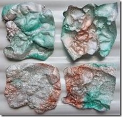
For my next experiment I applied colour to Lutradur, Tyvek and Bondaweb. The Lutradur I have is very fine weight. It will be a good medium to apply heat to it for added texture to my samples. In my stash of stuff are unopened jars of Colour Craft Metallics fabric paint in Silver, Copper and Turquoise (bought from a show, but never used…). Humm me thinks, will this fit in with my colour scheme? Let’s give it a go… Did the same on two weight of Tyvek and some bondaweb.
 |
In dried form they look quite brash (the jar does say ‘will add a dazzle to your work’!). I was patient to see what happens when heat is applied to the samples.
The two types of Tyvek (middle image) with heat applied to show convex and concave patterns – this does create a bubbly texture which might be useful for interpreting texture in the stitched samples. The Lutradur and a piece or organza with heat applied, I was gentle with this as it can very quickly disappear. Again, a useful texture which could be layered and stitched through.
Applying colour to fabric with Transfer Paints
I have tried transfer paints before mixing the colours from the powders but had poor results – the colours were very pale.
This time using the pre-mixed versions in small jars so I knew the level of dilution should be correct. I painted some jazzy patterns onto printer paper with Turquoise, Scarlet, Orange, Lemon, Emerald Green and Violet colours and left them to dry.
Evaluation of transfer paints
Using a polyester satin fabric with matte finish. The outcome is not as good as I hoped. I was worried about the heat of the iron on the polyester, so started at a warm level then increased the heat as nothing was happening. I timed how long I ironed the piece and it was five minutes of circulating the iron over the piece of A4. The above image shows the violet reproduced well, some of the small red dots have come out well – the paint was quite thick for these, but all the other colours are pale versions.
Similar heating routine to that above. For a piece of voile the resulting colours are even paler than on the satin. This may be OK if this is for a panel that need a high degree of transparency, but it was a lot of work to get to this stage. I’m glad I tried the transfer paints again, but for me they are not worth the effort, and they are expensive. |
Printing directly onto fabric.
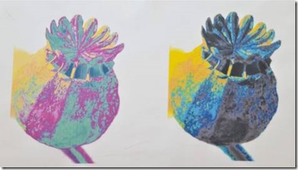
Feedback from Sian suggested I should try printing my digitally enhanced images directly on to fabric for stitching into. To make the print colour fast, I soaked white cotton in Bubble Jet 2000 liquid. When dry, ironed it to freezer paper then put it through my printer at a high-resolution setting.
The disadvantage of this method is that the background around the object may need to be transparent, so the image may need some more digital tweaking before printing. Also, in the home environment, the print is limited by the size of paper the printer will cope with.
There are professional services that can print onto fabric with designs; for example, Laura Kemshall - https://weprintyoupaint.co.uk/about-custom-digital-print/
Day 4: Evaluation of Experimental Dyeing
Overall the results are an amazing collection of coloured fabrics. Within all the bags of fabric there is a great variation in the extent of dye uptake which has produced some lovely patterning across each piece of fabric. For those fabrics that may be too pale, this is OK as I can either over-dye the fabric or use it as a background for printing onto.
I don’t mind having the variable results as these have provided points from which I can learn. For example: Was the water too hot when mixing the dye powders? - This can cause the dye to work too quickly and not produce good results when adding later pieces of fabric. Am I still putting too much fabric in the bags for the amount of dye? Are the bags too small for the amount of fabric? Had the dye ‘gone off’ overnight?
All of the fabrics included in the bags are ‘natural’. However, for each of the single colour plain fabrics (Ultra-Marine, Turquoise, and Orange) I added a some sinamay and some sisal fibres to see if they would take the colour.
 |
 |
 |
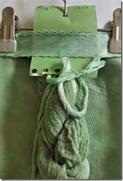
For each of these bags of single colour the silk velvet took the dye in the strongest most even colour, with the cotton, silk noil, scrim and cotton edging doing quite well, but with quite a bit of variation. The silk mawata hankie has some lovely colour bits round the edges but also some patches completely undyed. The linen scrim, scrim and cotton added after one hour are very pale. The sinamay and sisal took very little colour. This does mean I have a range of shades (tones?) in complimentary colours for use in my work.
For the dye family experiments – I was really pleased with the results of the Emerald Green and Violet dye mixes. From Ruth’s book the suggestion stated each bag was to have 25ml of dye added, with a variation pre-mixed from each of the two colours.
 |
 |
 |
Bag 1 was a mix of 23ml Emerald Green + 2 ml Violet
Bag 2 was a mix of 20ml Emerald Green + 5 ml Violet
Bag 3 was a mix of Violet (in first) 15ml + Emerald Green + 10ml
On the second addition of dye (see previous post for why I did this…) I doubled the quantity of dyes added to each bag and left the dye to work for another 24 hours. Now the fabrics are ironed, I am very pleasantly surprised at the result – but having looked at the photos in the book, I’m not sure if this is what was expected – the examples shown seem to be much more even and more vibrant. However, my painted colour swatches on paper show a subtle colour and in my results the fabric colours are quite subtle, which is why I think there may have been a problem with how I mixed the dyes or how much fabric I put in the bags. The variations are superb, producing lovely effects. I like the way the colours have split so that the green and violet can be distinguished in different tones. What is surprising (to me) is that from bag 1 and bag 2 the violet is very subtle, almost a grey colour, so unexpectedly I have created a pale grey for my colour scheme. In bag 3 I had a spare skein of silk thread and this has taken the colour variation very well – so an excellent result.
For the Turquoise and Lemon mix – I was very surprised – I have worked with this colour combination before so was expecting very vibrant results.
 |
 |
 |
Again, for each of the bags, 25ml of mixed dye was required, and I doubled this on the following morning. The original quantities were
Bag 1 22ml Lemon + 3ml Turquoise
Bag 2 18ml Lemon + 7ml Turquoise
Bag 3 3ml Lemon + 22ml Turquoise
The results are more subtle than I expected and not such cool colours. I would class the green from Bag 1 as a warm green so what has gone on here I do not know. All my fabrics are usable so I am not upset about the variation I have achieved. However, this exercise has taught me that much care is need when mixing the dyes, particularly temperature and how long the dye sits around before applying it to fabric. The ambient temperature outside is very warm at present this may also have affected the uptake of the dye. What is clear is that dyeing fabrics can be unpredictable so one must embrace serendipity, or just keep practising until one becomes used to working with the right quantities of fabric and dye.
(Note added later – I went back to my notes from when I used this combination of dye before, and the quantities of each colour were different, I am not so surprised at the result after all. I also feel vindicated that I did write down the quantities previously even though someone called me nerdy for doing so! Thank you Sian for reminding us to keep up this good practice!)
Day 5: Preparing the Colour scheme board.
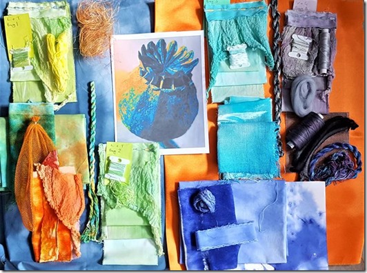
I how have a good range of different natural fabrics and yarns in a range of colours that match my chosen image. I will probably use the Tyvek, Lutradur, coloured bondaweb and pelmet Vilene but not the synthetics from the transfer paints. To have some bold colour I have augmented my fabrics with a few commercial synthetics, such as satin and organza, and the contents of a couple of ‘experimental bags’ from Oliver Twists that include things like wool tops, throwsters waste, carrier rids, Angelina fibres, wire and so on.
Putting together the board was great fun, but a challenge on what to leave out. Because I have such a range of colours to use, I decided to use a dual colour background – an idea I might use in my stitching samples. This allows me to use complimentary colours to set off the subtle as well as the bright shades. The orange satin is perfect for the bright blue, turquoise and purple/greys. The darker shade of dyed blue fabric, is good for the orange and orange/turquoise mixed fabric as well as the lemon tones of the lemon turquoise mix.
I am now looking forward to using this colour scheme for the next section where I can start putting my stitching ideas onto fabric.


No comments:
Post a Comment