Observe and Record Colour
I selected a section from each of the four images that had a good range of colour representative of the stages of manipulation. I now have four windows for recording the colours across a selection from each image. Unfortunately the images below do not reflect the vibrancy of the colours on my printed versions.
 |  |  |  |
| Window 01 | Window 02 | Window 03 | Window 04 |
Using a magnifying glass for details I observed the following in each of the images:
| Stage 1 window | Stage 2 window | Stage 3 window | Stage 4 window |
observed colours - Yellow-orange
- Orange
- Pale yellow-green
- Mid-green
- Pale bluey-green
- Mid-grey
- Darker grey
- Very dark grey
| observed colours - Yellow-orange
- Orange
- Pale yellow-green
- Mid-green
- Pale bluey-green
- Mid-grey
- Darker grey
- Very dark grey
- Pale turquoise
- Mid turquoise
- Blue-violet
| observed colours - Yellow-orange
- Orange
- very pale red-orange
- Pale yellow-green
- Darker yellow-green
- Mid-green
- deeper shade of mid-green
- Pale bluey-grey
- Mid-grey
- Darker grey
| observed colours (in order of quantity in window for colour exercise below) - Mid-Green
- Deeper shade of mid-green
- Yellow-orange
- Orange
- Very pale red-orange
- Red-violet
- Violet
- Pale yellow-green
- Darker yellow-green
- Pale bluey-grey
|
Describing the colours was quite tricky for the above, rather than a good description I was trying to identify the number of shades and tones I could see. Hopefully when I mix the basic colours it will be easier to to lighten or darken them to get the range.
For the next stage I use different media to experiment with mixing. I decided to use my good quality materials as I want to do the best I can as colour mixing; practising in my 'Little Book of Colour'. Watercolour pencils (Derwent); Acrylics (Daler Rowney System 3), Oil pastels (Sennelier), Water colours (Winsor & Newton Cotman) from a tube.
 |
Window 1 strip coloured with Acrylics. To mix the three shades of green I started with a lemon yellow with a touch of cerulean blue to get the mid green. white was added for the pales tone, then a touch for cerulean with a bit of white for the pale bluey-green. For three shades of yellow to orange I started with cadmium yellow adding a very small touch of scarlet, then adding a bit of white until the right tone was mixed. Payne's Grey was used for the darkest shade of grey, for the pales shades, I started with a white, adding a touch of Payne's Grey to achieve the correct shades. Only very small quantities are required for the sample. These acrylics mix very easily straight from the pot to produce vibrant colours and can be blended by adding a touch of a second or third colour. This colour strip only took a few minutes to complete. The finish of the colour is opaque, with no bleed at the edges. If used on fabric, the paint can be set with a hot iron, but it is not washable. |
 |
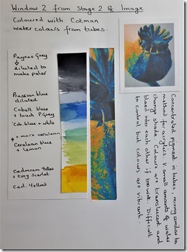
Window 2 strip coloured with the Cotman water colours. These come in small tubes so are very similar to mixing and blending as for the acrylics, for similar tones and shades. for the Mid turquoise I added a touch of Prussian blue to the cerulean, and for the Blue violet I used a cobalt blue with scarlet. This exercise was quite quick too. The colours are translucent so blending of colours at the edges when wet can lead to bleeding into each other giving further tones and shades. When dry the colours are vibrant. I have heard that water colours can be used on fabric if it has been treated with fabric medium – I haven't tried this yet so don't know what the result will be. |
 |
Window 3 Coloured with Sennelier Oil Pastels. The pastels ae soft to work with and can be gently blended with a cloth on the finger tip. Beginning with a base layer of the predominant hue of each block, I added a touch of another colour to change the tone /shade to that required, blending more or less as required. If a paler tone was required I added a layer of white, If slightly darker, a touch of grey, then a small amount of black blended. I haven't worked with pastels very much, so this was a very interesting exercise to complete. The pink pig sketch book paper has a very slight texture to it which is picked up in the pastels, providing extra interest to the strip of colour. The layers do build up and can be quite thick and opaque, would be difficult to manage in very small areas. |
 |
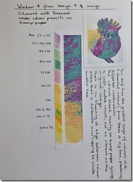
Window 4 coloured with Derwent water colour pencils on damp paper. This strip has the greatest range of colours in it. I have a number of shades of green in my box so did not have to mix the green as for the acrylics and water colour tubes. The pencils do blend easily and give a soft finish. The nature of the pencils allows for precise colouring as the paper was only damp and the pencils a solid colour. There was very little bleeding between shades, unless I deliberately overlapped two areas. The water colour pencils are not as translucent as the tubes of water colour paint and not as vibrant when dry. |
|
|
|
|
|
|
Part 3 to follow: Messy days: making coloured papers and textured surfaces |


No comments:
Post a Comment