Making Coloured Areas From Window Four – Exploring Markal Paint Sticks & Dekka Silk Paints
I chose the colour scheme from image four to explore with media as it has the greatest range of colours. I got a bit carried away with some of the media as I wanted to see what the results on different bases. For the first test I chose Markals as media to experiment with as they can be very useful for adding colour to the surface of fabrics with the use of masks. With care colours supposedly can be blended to soften the effects of a single colour. If using on fabric after 'drying' for two days, the colour is set with a medium hot iron (using silicon paper to protect the iron and ironing board). For the second test I used Deka silk paints as these too can be used on fabric and be set with an iron.
 |  |  |
| Markals 01 | Markals 02 | Markals 03 |
 |  |  |
| Markals 04 | Markals 05 | Markals 06 |
Results of Markals:
01: The base is a rubbing block made from crushed eggshells mixed with PVA and plaster (left to dry for two days). The paper is a recycled envelope made from Indian cotton rag paper. I was aiming to achieve the red-violet and violet colours using the iridescent blue and red sticks with some white. The blending was difficult on paper, as more colour was added I was losing texture through the paper. which is quite thick. I couldn't get the exact hue I was looking for. paper, I was able to
02: Using the egg shell base, I repeated the above on calico. This time trying for paler version of red-violet and violet colours. Using iridescent blue, with a touch of green then overbrushed with a touch of red. The calico received the markals better than the paper; the toothbrush was able to get between all the crevices of the rubbing plate, and highlight the sharp edges of the shells. The colour is still not quite right but the texture is better than that found with the paper.
03: Using a commercial stencil with iridescent blue, green and red on calico. I tried the stencil beneath the fabric but the pattern was too feint to notice. Then tired with the stencil on top of the fabric, rubbing the markals across the stencil (secured with masking tape). The layers of colour were bold, with the marking quite stark – too stark so the fabric was rubbed all over with white to knock back the colour.
04: Using textured wallpaper to achieve the bluey-green colour. Iridescent blue, green and yellow. This worked quite well until I started to use the toothbrush to get to the base of the paper. If I rubbed to vigorously, the surface texture breaks down. The colour is not as good as I hoped.
05: Gesso on card with distressed sinamay pressed into gesso. The background was tricky to make without having too much gesso on the card. There were still some grey areas of card showing. I didn't want to paint the card before starting in case I lost some of the texture. Mixing the yellow and red to achieve the orange colour was very difficult – the top half of the photo shows the result. I tried to soften the colour by rubbing white into the texture, this did help blend the colour better.
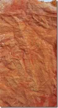
06: Crumpled tissue glued to card with yellow and red. Lots of yellow applied to the card first – then with very little red brushed into it. The red is difficult to control, just a small amount is needed, too much will change the result significantly.
The results from markals are interesting – I did not achieve the exact colours I was expecting, but I have found that good textures can be achieved if one can be flexible with the colour outcome.
Results from Deka Silk Paints
I had difficulty blending the colour needed so I tried with a liquid colour – Deka silk paints are colour fast when dried and ironed so are useful for fabrics. The liquid nature means they can be mixed more easily, either directly on the fabric if a gradual change of colour is needed or by mixing before application. My three samples below are on different textures:
 |  |  |
| Deka 01 | Deka 02 | Deka 03 |
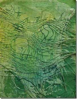
01: The base is crumpled tissue with PVA on card. Cool colours (petrol & karmin) used. Starting with one colour painted on the right hand side and the other on the left gradually mixing in the middle. This is the nearest I have got to the colours in my image.
02: The base is distressed sinamay attached to calico with a mix of plaster and PVA. I expect to get variable results with this as the different surfaces will vary in absorbing the paint. This time petrol and lemon (both cool colours), starting with lemon washed all over the surface, then a very small amount of dilute petrol colour washed over starting from the middle, to leave a paler colour on one side, with a deeper hue on the other. The plaster covered side is much paler, while the exposed fabric has taken the colour better and nearer the mid-green colour I was looking for. This is worth knowing as introducing different surfaces in the work does have interesting results..
03: There is a very small amount of red-orange in the image, finding this tone was difficult. Both colours are from the cool side; starting with lemon in a dish, mixing a tiny bit of karmin until the right tone achieved. Too little karmin and the mix was too orange, too much karmin and it easily became too red. There was quite a bit of trial and error for this mix!
For other results of creating areas of colour – see above in write up about messy days.
No comments:
Post a Comment