Colour Grouping
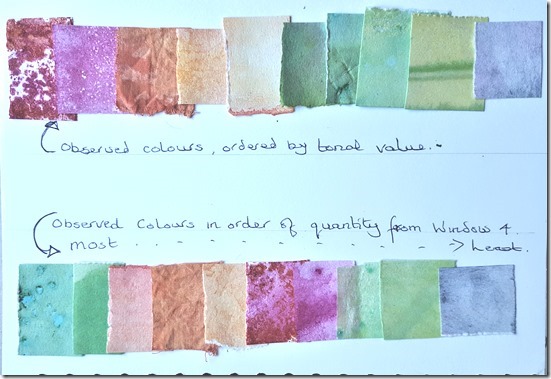
For the exercises above I referred to my colour mixing charts shown below for selecting colours in my image (cool/cool, warm/cool, warm/warm). As it happens all are from the cool/cool range so all belong to that group. Then separating into three more groups. I used the papers coloured with the dilute acrylic paints for Group 1, comprising pale yellow-orange; yellow-orange adding more vermillion for the deeper hues, then vermillion & cerulean for the deepest hue. Variety in the surfaces was achieved by stacking the papers on top of each other while wet, or sploshing less dilute colour onto different areas. My draining board left some interesting marks on the paper on the bottom of the stack . Dilute Brusho used for Groups two and three. Spraying lemon then turquoise for the pales yellow-green, then gradually adding a touch more turquoise. Different tones also achieved by adding more water to the paper before spaying. For added interest I added salt to the layers (Yellow-Green through to dark blue-grey range). The pale blue-grey areas of group three were the most difficult to achieve – the base is Payne's Grey (slightly less intense than black) at different level of dilution, then by adding a separate mix of magenta and turquoise for a purple hue to the mix.
All the base colour used are from the cool side of the spectrum, and in my photos below I have ordered them from palest to darkest.
I made six small sample books grouped by technique: Thai silk tissue sprayed with Brusho. Waxed Thai silk tissue. Papers sprayed with Brusho, sprinkled with salt. Papers washed with dilute acrylics. Painted pages embossed with patterns (some over printed with colour). Samples of the Cocoon strippings silk paper.
Colour Circle
I have done many colour circles in previous courses, so do not feel I need to complete this exercise.
Colour Exercises
Summing Up
I spent about six full days on this part of the course. This was mostly because I spent some time playing with digital enhancements on the computer to get some suitable colour images, then quite a while making surfaces to work on and quite a few of the techniques needed advance preparation. I have also spent the time writing up notes on the blog, preparing the photos to go with it and, presenting it in my book.
The work from my messy days created many different coloured sample areas - far more than the ten I expected to do from window four. I made a list of techniques and media I could use, but have not made samples from them all – this is something I could pursue further another time. For example, I could have used the fabric paints, these would give different results from that above. I really enjoyed making the different surfaces to work on, as these provided some lovely textures, especially when two or more colours were layered together. Although I found that It is difficult to achieve the exact colour I expected, serendipity has given me a massive new selection of papers and some fabrics to be used later.
Health & Safety for Colour
Number 1 – Wear rubber gloves when spraying paint on pages! – I don't always do this and when using the Brusho my hands were very stained and took several hours of hard scrubbing to get them presentable again.
Number 2 – Read health & safety information regarding pigment powders, gesso, other surface applications - wear a mask if required, work in a well ventilated room.
Number 3 – Work in an area suitable for messy work - cover surfaces with plastic for easy cleaning.
Number 4 – Work in a well ventilated room when melting wax – have a well padded surface (with for example,newspaper) to absorb surplus wax – ensure trailing wire from iron is out of the way.
Number 5 – When cutting papers etc, use scalpel with care. Keep sharp point embedded in a cork or similar.


![colour strip on black_thumb[3] colour strip on black_thumb[3]](https://blogger.googleusercontent.com/img/b/R29vZ2xl/AVvXsEg0P85FN4sjpLE6Gdj-Yvt6MeNNucAGzsAagibyVKHv09GKdSvnJRLeVmI538GM6rqR5z_qSfYqFTTEJjFfl-fz_t79gPpodvKiwD7Fj12YnfsRKHSj6-LAzDnAAPCSBhyecaQaFw2o8g/?imgmax=800)
![colour strip on pink 01_thumb[4] colour strip on pink 01_thumb[4]](https://blogger.googleusercontent.com/img/b/R29vZ2xl/AVvXsEjMN4B-uxF0yXXctCJfbf-ZNKxRMHdud6eQXnbygBc3y8pIl8wPqR2EqBbPv7YM8-sZfsIE_2EQsHcAzXdzt9tCvonnqySrD55C1-J4p8INwYr-ICEOHmE0WRJKOCECFeOAUnspuKQdCg/?imgmax=800)
![colour stip on pink 02_thumb[4] colour stip on pink 02_thumb[4]](https://blogger.googleusercontent.com/img/b/R29vZ2xl/AVvXsEgVl9Dk-XfqwqHkF42F_J4B5KXYmOCfNDgWomguOhVnGR5itjuaT7Qw1Y00mmA6nDymvDux0EigTlziVF8yw-MP25Exo98DqAaC2esdnb1dOev9Gd9Ww67-x-B6IRdlq7_JFFszPZvp8A/?imgmax=800)
No comments:
Post a Comment