Exercise 9 Re-visited – 19 June
Much appreciated positive feedback received from Sian on most of Chapter 4. However, there are some revisions required. My previous attempt at drawing a letter on a page was very ordinary so I was not surprised when Sian suggested I have another go at it. I had some more thoughts of how to put together the shape and a letter so tried a few ideas:
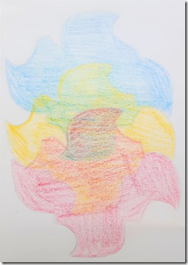
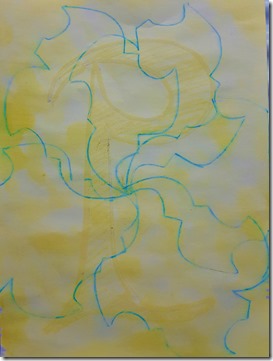
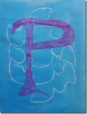
My first attempt (09 c1) comprised colouring three overlapping shapes with the Derwent water colour pencils. My idea was to colour a textured P over this using sequin waste as a rubbing plate. I liked the first part, where the overlapping areas produced different hues I secondary colours. However, the overall colours looked quite pale so I decided to dampen them to bring out the colour and then it all went wrong… Perhaps I should try this with a different water based medium e.g. Koh-I-Noor colours.
 |
 |
| Ex 09 c1 Overlapping shape coloured | Ex 09 c2 Large P overlaid by rubbing paper on top of sequin waste |
Feeling a little despondent I decided to create something digitally…
 |
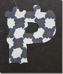 |
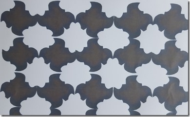
| Ex 09 f Digitised shapes rotated printed from computer | Cut-out P on dark background |
In this iteration (09 f) I digitised the shape and made the background transparent, for use on the computer. This allows me to resize and recolour the shape for use in printing.
I hadn’t been happy with the previous overlays so thought I would try a different style. I like tessellating shapes and patterns so had a go at creating a repeating rotating pattern across the page, then printed it on good quality paper. On the back of the page I cut a reverse large P, but I gave it bumpy edges…
This was my best attempt s far so I sent it off to Sian with the question “Is it OK, or is it too fussy?”
If I am asking that question obviously Sian is going to say, Do you think it is too fussy, how can you change it? Changing Size/ Scale? Changing Colour? Changing something?
So back to the drawing board with this idea… This could be why I don't like adding text to my work – it all becomes too complicated.
Having left exercise 09 at the point above, I worked through the exercises for 17 and 18 (see below). In 18, I was using textured wallpaper to make blocks for printing. Being pleased with the result, I decided to have another go with this exercise. Using a striped texture and mottled texture I cut two more blocks. This time I printed the P at an angle, the linear stripes seemed to go well with the shape. I used a bold colour (the Jackson's Water Colour Indigo), then using its complimentary yellow-orange, again a good quality paint from Jackson's, I printed my shape over the P. I am much happier with the outcome. I have printed it on pale cream cartridge paper, which leaves it looking a little dull. If I were to continue pushing this exercise, the next step would be to experiment with different coloured backgrounds, outlines or textures to see what would give it a little lift. At present I am reluctant to put a colour wash over it in case I spoil what I have achieved so far.
 |
 |
| Ex 09 h1 Blocks with textured wallpaper | Ex 09 h2 The printed page |
I now feel I can move on from this exercise having achieved something I am mostly satisfied with and see its potential. As a bonus, in future, I might not be so reluctant to add text to my design work.
Exercise 17 Re-visited 21 June
My previous attempt at this exercise went a bit awry – I didn't quite understand what to do. So here goes with some more trials.
Sian suggested that some shapes might be better with horizontal strips and others with vertical strips. It suddenly dawned on me use textured wallpaper with stripes as the base then play with the two orientations. Off to the DIY store to pick up some samples of textured wallpaper, then back to playing… In my stash I have lots of space dyed scrim, just what I need. These are easy to manipulate to create softer edges and more texture. Here I wanted to make light airy lines, forget the paper strips that looked too lumpy.
Ta Dah!
Shapes with strips. Background coloured with oil pastels, cut out shape from wallpaper and coloured with oil pastel to bring out the texture.
 |
 |
| Ex 17 c Vertical strips | Ex 17 d Horizontal strips |
I prepared these samples so they sit side by side in my book – I am much happier with this version. I feel I have now taken this forward with something more interesting.
 |
| Ex 17 c and d, ready for distressed scrim to be glued to background. |
Exercise 18 Re-visited 21 June
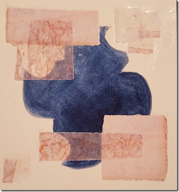
Second time around, I enjoyed exploring this exercise. I feel more confident about my shape and using bolder colours. I found some painted cartridge paper and waxed paper from my stash for Exercise 18. I chose the waxed paper as it is translucent and has lovely markings from when it was crumpled. My background image is a much stronger colour – I used a good quality watercolour from a tube (Jackson's own brand in Indigo), rather than the watercolour pencils. Although more difficult to control the hue is stronger and more impressive. I like the result of this sample as my shape is looking very different.from its original outline. Some of the edges are hidden while others can be seen under the waxed paper. I like how the patterns on the waxed paper change depending on what is beneath it. |
|
| Ex 18 Rectangles with gaps to partially reveal shape |
I haven't yet completed exercise 19 but I will create another sample similar to the one above then couch some interesting threads onto it.
With my newly acquired textured wallpaper samples I made four blocks that I can use to print onto paper. I also have different sized templates from my digitised image. I can now produce some better looking shapes for the next exercise.
I am so pleased I re-visited these exercises. I have learned so much more about trying again, and using different techniques. I hated Exercise 9 the first time around, but perseverance has paid off. I have a result that I can move forward with. The same goes for exercise 17 – my first attempt was a disaster, but just thinking a bit more about stripes, and how they work on the horizontal and vertical has been an eye opener.
Going bold with good quality paint has been a good lesson too. I got a better result.
For these exercises a spent about 10 hours (most on the digitisation! and playing with tessellated shapes). All of Exercise 17 and 18 and my last attempt for 09, were done in one afternoon.
Now I get on with Chapter 5. I already have some interesting images to play with and have been preparing different textured papers and fabrics to colour.

No comments:
Post a Comment